


WooCommerce Mobile Optimization: How To Optimize Wholesale Order Forms For Mobile Users

Optimizing the WooCommerce mobile checkout experience is a must if you want to stay competitive in today’s digital landscape. As of 2024, mobile devices account for more than 60% of overall website traffic. As an e-commerce business owner, the goal is to provide a superior purchase experience, regardless of the platform your valued customers are using.
No worries, we’re here to help you out! In this helpful article, we’ll share actionable tips to help you optimize your WooCommerce order form for mobile use. Implementing these simple tips will help you enhance the overall WooCommerce mobile experience and streamline the order process for your valued wholesale customers.
So, let’s get right into it!
Why Optimize WooCommerce For Mobile?
Have you ever considered the impact of your current WooCommerce mobile experience on your B2B sales? These compelling statistics highlight why optimizing the mobile purchase experience is imperative for wholesale businesses like yours:
- 80% of B2B buyers use mobile phones at work, with more than 60% reporting that mobile played a significant role in a recent purchase
- Mobile sales accounts for 40% of revenue for B2B companies
- 50% of B2B queries today are made on smartphones
- 90% of B2B buyers are more likely to buy again from the same vendor after experiencing a superior mobile experience
These are just a few of the most compelling statistics that highlight the impact of mobile optimization on B2B sales and customer satisfaction. By ensuring that your e-commerce business is optimized for mobile purchases, you can take advantage of the growing mobile commerce market and drive revenue growth for your business.
6 Easy WooCommerce Mobile Optimization Tips: Create Order Forms That Convert
Since wholesale customers buy in bulk, it’s important to give them a streamlined order experience. Providing dedicated bulk ordering forms for B2B buyers is one of the best ways to do this. With an intuitive, one-paged ordering form, they can easily select products, add to cart in bulk, and checkout without having to navigate a long product catalog.
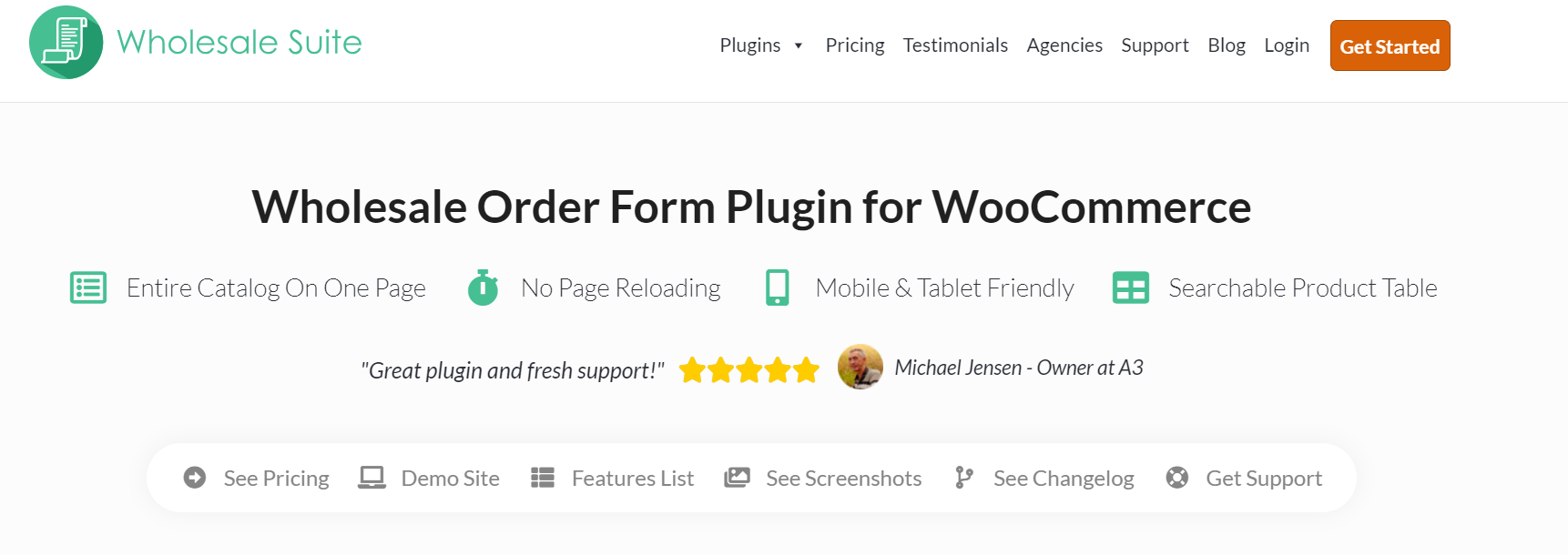
Fortunately, this is easy to implement with the right tools. WooCommerce wholesalers can leverage tools like Wholesale Order Form to create one-paged order forms for B2B buyers. With this tool, you can create fully customizable bulk order forms for B2B buyers to give them a streamlined shopping experience.
Now, let’s get started with the actionable tips!
1. Customize the number of products displayed in your order form
The last thing you want is to overwhelm your customers with a cluttered order form. To create a better WooCommerce mobile experience, consider limiting the product listings on your wholesale order form. One study suggested limiting product listings in mobile devices from 15 to 30 products. Better yet, implement lazy loading.
Lazy loading is a webpage optimization technique wherein content is only loaded when they are needed. Instead of loading everything at once, lazy loading loads content (products, in the case of order forms) as the user scrolls down. This provides a smoother and more seamless product browsing experience for your customers.
Plugins like Wholesale Order Form allow you to implement either pagination or lazy loading in your wholesale order form. The best choice for your business will depend on how extensive your product catalog is. If you have a large number of products, lazy loading may be the ideal option to ensure better performance on mobile platforms.
2. Allow for search and filtering options
Another key tip in creating a seamless WooCommerce mobile experience is empowering your wholesale customers to quickly search for the products they need. More often than not, B2B buyers already have specific requirements and preferences in mind when searching for products. By giving them search and filtering options in your order forms, you help them save time and enhance their mobile browsing experience. Consider:
- Integrating a search bar in your order form: Allow your B2B customers to enter product names, SKUs, and other keywords to help them quickly find what they’re looking for.
- Providing filter categories: For example, you can allow customers to filter via product categories, types, price ranges, availability, or brand. Use dropdown menus to make it easier for users to filter and refine their search.
- Utilizing sorting options: Let customers sort based on price, availability, or product popularity to give them greater control over the product listings displayed.
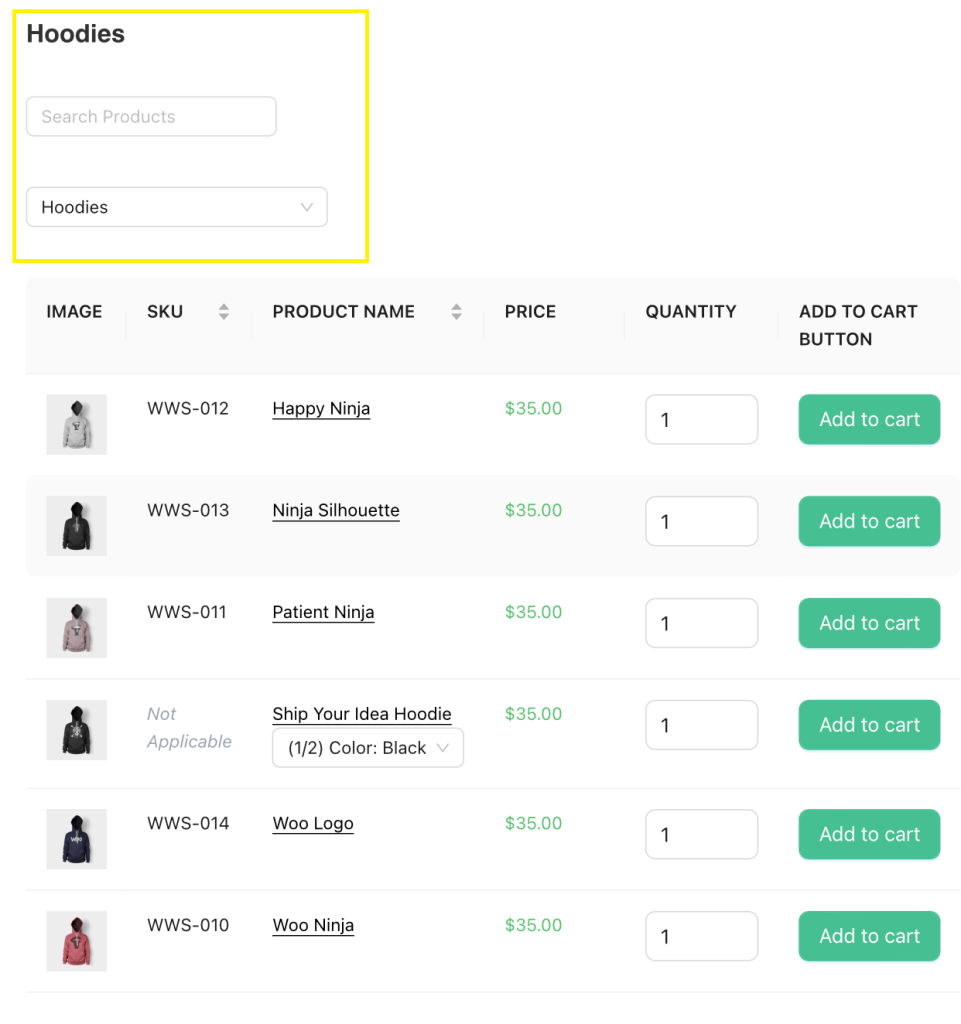
Wholesale Order Form makes implementing this step a breeze for WooCommerce wholesalers. With this plugin, you can enable search and filtering options in your wholesale order form, allowing customers to refine their product search in your store.
3. Optimize your add-to-cart buttons
The placement of your Add-to-Cart button is crucial when it comes to enhancing the WooCommerce mobile experience. The goal is to make it seamless and easy for wholesale customers to add items to their cart.
To help your B2B clients save time, consider displaying your Add-to-Cart button next to each product in your order form. This placement is helpful for a number of reasons:
- Saves time: With the Add-to-Cart button next to each product, mobile users can easily tap on the button to add items to their cart, saving time.
- Reduced clicks: Having the buttons readily accessible allows users to complete their purchase with fewer clicks.
- Clearer visual cues: Simply put, displaying the Add-to-Cart buttons prominently next to each product row provides clear visual cues for mobile buyers and enhances the visibility of your call to action. This makes the order experience more intuitive and frictionless.
4. Limit pop-ups
Pop-ups are small windows or banners that appear while users browse a website. While they can be powerful tools to capture leads and promote special offers, they can be quite intrusive during mobile browsing. The key is leveraging them strategically.
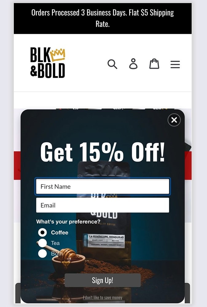
Consider disabling them on your order form pages or timing their appearance to minimize disruption. For instance, avoid displaying them immediately upon page reload, or while customers are engaged in a task. Tools like OptinMonster allow you to trigger pop-ups based on user behavior or exit intent, ensuring they appear only when relevant to your audience.
5. Use a mobile-friendly WordPress theme
One key advantage of using the WordPress and WooCommerce ecosystem is its flexibility: you can switch to any theme, at any time. If you haven’t already done so, it’s time to switch to a mobile-friendly theme. So, what makes a WordPress theme mobile-friendly? Specifically, your WordPress theme should be:
- Responsive: A responsive theme automatically adjusts and optimizes its layout based on the user’s device and screen size.
- Lightweight: These themes prioritize performance and have smaller file sizes, which makes your website load faster.
Check out some of our top picks here!
6. Test your order forms
Testing your order forms allows you to easily identify the bottlenecks in your WooCommerce mobile optimization efforts. This step allows you to put yourself in the shoes of your valued customers, helping you uncover their frustrations, and find ways to solve them promptly.
Evaluate the performance of your order forms by testing in a variety of mobile devices and web browsers. A mobile-friendly website should work seamlessly with popular browsers such as Microsoft Edge, Google Chrome, and Safari.
You can also leverage testing tools like Google Lighthouse to help you audit your website. This free, open-source software assesses your website’s performance and accessibility and offers suggestions for improvement.
Conclusion
Optimizing the WooCommerce mobile purchase experience is key if you want to thrive in the modern business landscape. More and more B2B buyers are using mobile devices to research and buy products online, and you want to drive them into your store. In this article, we walked you through six easy and actionable tips to make your wholesale order forms more mobile-friendly. Let’s quickly recap them below:
- Customize the number of products displayed in your form
- Provide search and filtering capabilities
- Optimize your add-to-cart button placement
- Limit pop-ups
- Use a mobile-friendly theme
- Test your order forms
With tools like Wholesale Order Form, you can easily create one-paged, fully customizable order forms to make bulk buying a breeze for wholesale customers, regardless of the platform they are using.
Do you have more questions about WooCommerce mobile optimization? Let us know in the comments section below. We’d love to help out!
The post WooCommerce Mobile Optimization: How To Optimize Wholesale Order Forms For Mobile Users appeared first on Wholesale Suite.